Pie charts are everywhere. If you’ve ever had to present numbers, you’ve used them. They’re easy to create, look (superficially) smart and fill lots of empty space in your presentation or paper. I’ve used a ton of them, right up to the point that I found out they suck.
This revelation came courtesy of Randall Bolten’s Painting with Numbers. Bolten, an experienced Silicon Valley CFO, lists what he calls the deadly sins of presenting numbers.
This is number ten:
Deadly sin #10
Using a pie chart – period
Harsh? I thought so. Then I realised he was right.
Problem 1: pie charts are bad at communicating the basics
You should only ever use a chart if it helps your audience to understand your message. By themselves, pie charts don’t do that.
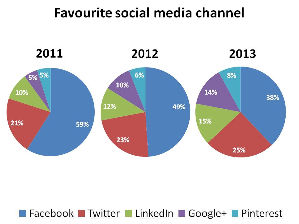
The chart below shows the favourite social networks of a large sample of UK adults. The precise numbers don’t matter (I made them up) but they make my point:
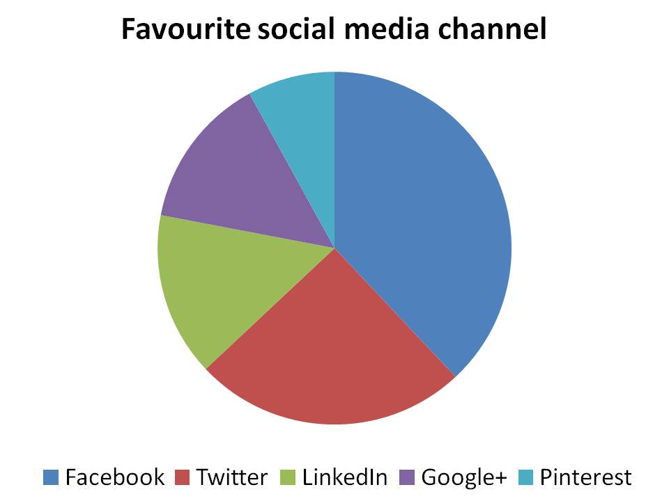
Some things are obvious from this: among my imaginary sample, Facebook is most popular and Pinterest the least. After this, things get hazy. Is LinkedIn more popular than Google+? How much more popular is Twitter than the next two? Remember that you’re showing a chart because you want your audience to form an opinion. They can’t do that from this chart.
Now let’s tackle the obvious objection: there aren’t any data labels. So let’s add some.
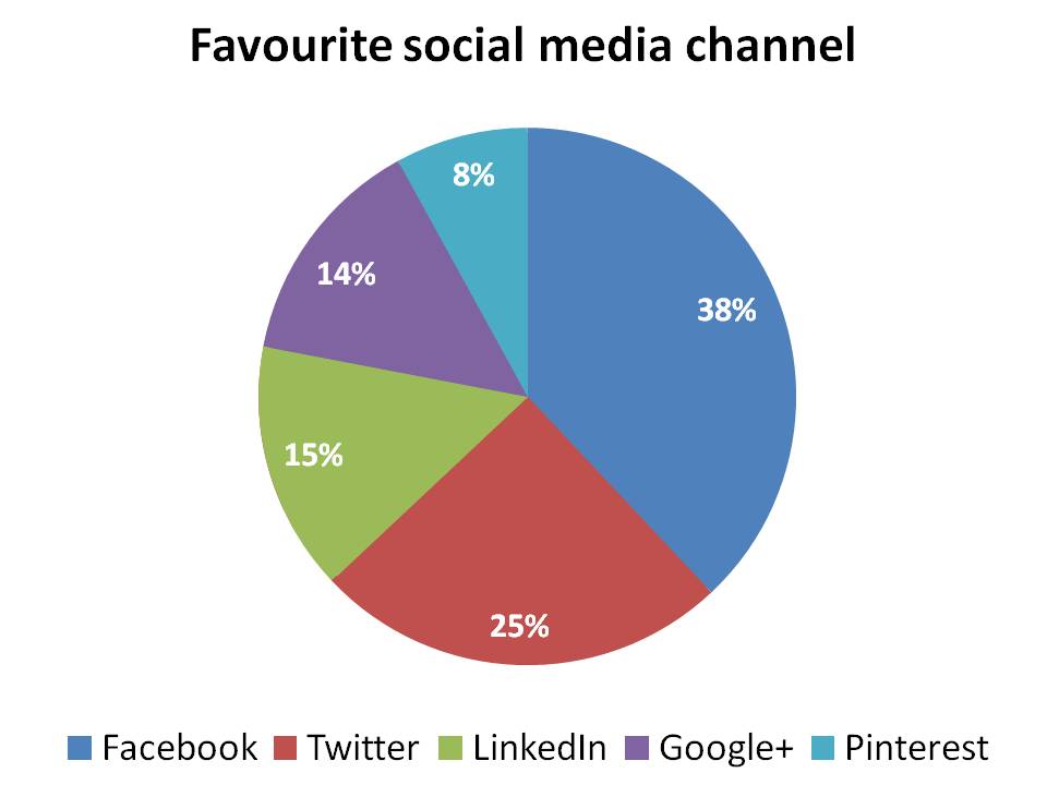
Now it’s clear how each of the networks ranks. But it’s also clear that the labels themselves provide the only useful information. You’d be better off just sticking them in a table.
If you want a visual aid, then a bar chart does the job perfectly.
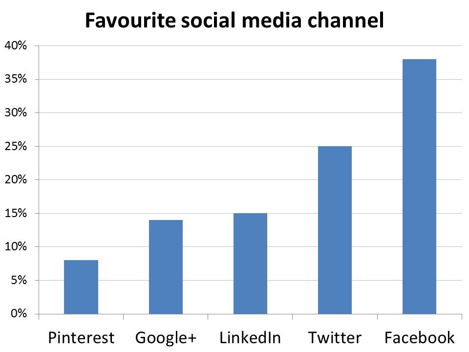
In a pie chart, it’s hard to accurately compare the segment sizes because they’re at angles to each other. In our bar chart, it couldn’t be clearer how each network ranks. It’s even easy to read off the percentages, without having data labels cluttering things up.
Problem 2: pie charts are worse at showing trends
Your audience might not be satisfied with knowing the current position. If you’re asking them to decide how to allocate their marketing budgets, for example, they’ll want to see trends. Pie charts are even worse at showing these than they are at explaining a single set of data.
First, pie charts use up far too much space, so it’s hard to get several side by side and still make them legible. Three sets of data is pretty much your limit.
Then we’re back to the fact that only the data labels allow you to make comparisons with any accuracy. But they’re even harder to use than with a single chart because your eye has to jump from chart to chart to chart. Hopeless.
For this kind of thing, a line chart is a good bet:
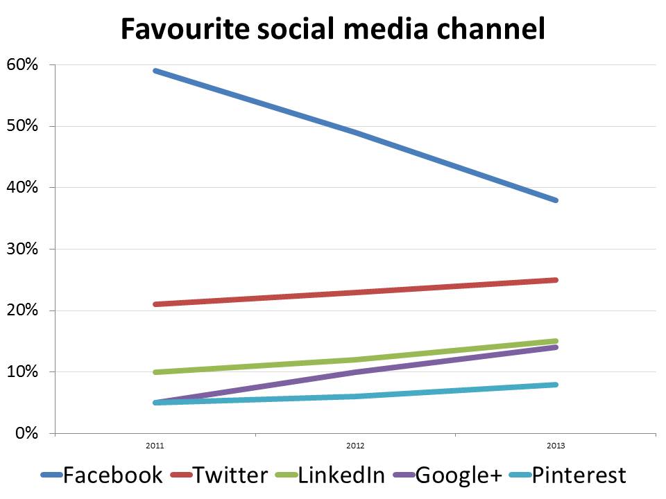
The trends in this chart could hardly be easier to spot.
Problem 3: pie charts are terrible at showing trends in absolute numbers
Pie charts are bad at showing trends in percentages but when we’re comparing trends in absolute numbers, they’re useless. To illustrate this, we’re going to switch to some different data, showing a simple cost breakdown for a growing company.
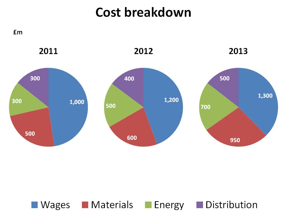
Here, it’s really hard to spot the trends. The wage bill is up by 30% and yet it’s a smaller proportion of the pie. Material costs have almost doubled but that’s only apparent by looking at the labels. These charts are terrible.
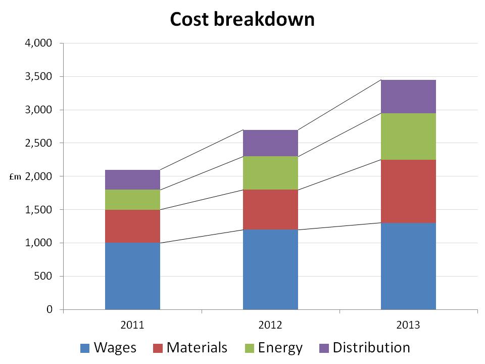
There are several better alternatives. My preference is a stacked bar chart. This clearly shows how total costs have moved and the gridlines make it easy to estimate the size of any part of the bars. The series lines emphasise the trends.
Bolten was right
Don’t fall for pie charts’ superficial charms. They’re never the best way to present data. There are so many better options, all of which are just as easy to produce and much more effective at making your point. Choose wisely.
Find out more
Learn more about our financial copywriting services. Or contact us to discuss your needs.